The jersey event in Los Angeles on Friday revealed all 30 teams’ new Nike Statement alternate jerseys for the upcoming season.
The Nike Statement jersey reveals left some grimacing, especially in regards to the Blazers’ new jersey, but I’m making case for the jersey’s uniqueness.
Here's the @trailblazers "Statement" jersey in contrast to the previous red alternate pic.twitter.com/ywxvLG3ZHb
— Casey Holdahl (@CHold) September 16, 2017
The event seemed and sounded like a lot of fun, and it was a big milestone in the NBA fashion world.
Unfortunately, a majority of Blazer fans did not enjoy the new alternate jerseys for their home team.
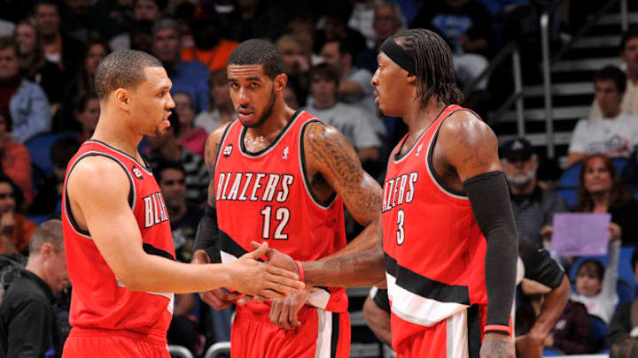
The new uniform contains the familiar red alternate color as the main splash.
However, instead of the black stripes mixed in with white and silver, along with white hints in the number and lettering, the Nike jerseys contain all black numbers, lettering and stripes.
Portland fans weren’t really “fans” of that choice by the Blazers and Nike. They were more than expressive on social media.
The biggest complaints stemmed from the lack of contrast the jersey brought. The shiny black stripes on the front of the jerseys weren’t a huge hit, either.
But, I don’t understand why.
The more I see these jerseys, the better they look to me. It came to full fruition when Moe Harkless wore it during the revealing.
The all-red shorts, like they always have been, are a hit. The “rip city” emblem on the front of the waistband, which will debut this year, rounds them out nicely.
Granted, the uniform would look a bit better if the black was solid and not shiny. Yet, the flare is there because of the reflective shine.
The numbers and letters look crowded in sketches, but the real things are perfectly spaced and legible.
Next: History of the No. 2 jersey
I’m positive these new uniforms will slowly grow in popularity in Rip City, especially when they’re worn in a game this season.
You can see more of the jerseys here and event here.
